
Project Summary
Role: Graphic Designer
Date: Jan - Feb 2022
Tools: Procreate, Adobe Illustrator, iPad Pro
Background
Sharp Wit and the Company of Women (or SWatCoW for short) is a queer comic anthology that crowdfunded in Fall 2022, raising over $30,000 with the help of nearly 750 backers. I had the pleasure of designing its logo.
The Whole Story
Beginning
When Michele Abounader and Brent Fisher of Extra Pages Press first approached me to design SWatCoW’s logo, they described the project as “a collection of short comic stories about “sword girls” [which is] a broad umbrella for any sort of cute person with a weapon.” The project would showcase 19 stories written and illustrated by queer folks, and was focused on championing and amplifying the voices of the LGBTQIA+ community.
As a nonbinary queer person myself, I was dying to help them out.
Nailing “The Vibe”
From the start, the pair had two requests: make the T in “wit” a sword, and make the ampersand a focal point of the design. The rest of it was up to me.
The people I work with are very passionate about their projects– They have clear visions of what they want their project as a whole to evoke, even if they don’t know what they want visually. But that’s what I’m here for, and that’s why Nailing The Vibe is the most important part of my process.
So I asked some more specific questions:
“Could you explain more about what you want this project to make people feel?” and “do you have any examples of the vibe you can share with me? It can be literally anything” and “do you mean goth like Maleficent or goth like the cover of Cinder?”
I got back some reference photos of similar logos, “the asymmetric punch of Cinder,” and most importantly:
“To me, [the vibe] is one of agency and empowerment, but with a defiant flair.”
Bingo.


Getting Sketchy

Vibe identified, it was time to sketch.
I came up with 3 initial designs that each leaned into a different aspect of the anthology. Additionally, I wanted to give them an ampersand that could be utilized on its own for branding and merchandise purposes, so I created 4 variations from which to choose.
Each variation leaned into a different aspect of the vibe, but Michele and Brent immediately gravitated towards version A.
Version A leaned into the diversity and defiant aspects of the anthology. I referenced the blackletter calligraphy style for it, and balanced out the length of the sword with a heavier ampersand.
I also specifically wanted to revoke the feeling of power and danger that might come from an adventurer choosing between multiple weapons before embarking on their quest. As such, I incorporated both a flail and an arrow into version A, and gave the sword more realistic proportions.
Sharpening the Design
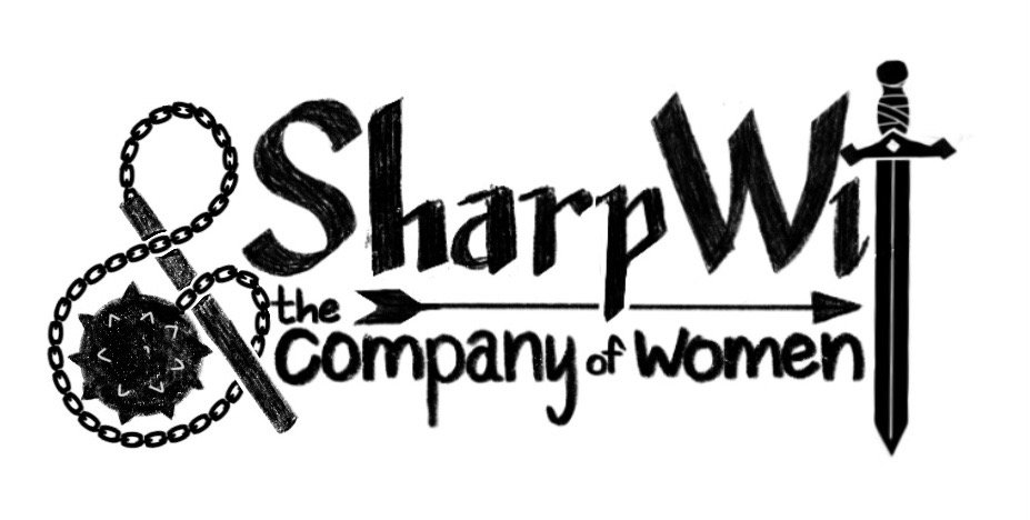
Version A was their clear winner, and they only had two requests: A smaller head to the flail, and a slightly thinner blade for the sword.
Once I sent over the revised sketch, it was time to turn it into a nice, clean vector.
While turning the sketch into a vector, however, I realized the cleaned illustration felt bottom-heavy. In an effort to remedy this, I took inspiration from the “fantasy” aspect of the anthology, and added some swirls that reminded me of early 2000’s fairy designs (Specific? Maybe. Correct? Definitely.)
So I sent two finished versions– the one we’d agreed on, and one with some flourishes that balanced the design.


They both agreed the flourishes looked better, and so all that was left to do was make some color variations.
“Wood & metal - like it was forged, painted & pretty”
I made 4 variations based on their description, and ultimately the pink was chosen as the winner!


Finale
When we finished our work together, Michele and Brent had this to say about the experience:
"Working with Asher on a logo for our new comic anthology has been a fun and wonderful collaborative experience. We approached them with an idea, and admittedly not a lot of concrete details, but they were able to sort through what we wanted in terms of style and aesthetic, and create a logo that was exactly what we were hoping for. The few revisions we had were quickly worked out with open conversation, and we could not be more thrilled with what we ended up with in terms of style, colors, and overall feeling. Cannot wait to launch the new project with the incredible logo they designed."
Sharp Wit and the Company of Women began crowdfunding in Fall 2022, raised over $30,000 with the help of nearly 750 backers, and was named as a Kickstarter “project we love.” More importantly, it helped amplify marginalized voices, giving them a platform to tell stories that center their own experiences as LGBTQIA+ creators.