Introduction
Root Network is a fictional social media site for gardeners. I was tasked with creating a broad overview of the network’s overall functionality and a seamless signup experience across mobile and desktop.
The Problem
Gardening works best when it’s done within a community that has accessible and personalized information exchange, but that community is not always easy to find.
The Goal
Create a gardening social media site with an account creation flow that feels the same on both desktop and mobile.
Empathize
For this project, I conducted an anonymous online survey of 33 gardeners, interviewed 5 gardeners of differing backgrounds, constructed aggregate and individual empathy maps, and did a competitive audit of 3 direct and indirect competitors.
Competitive Audit
After a community survey and subsequent research, I chose to investigate 3 competitors: Facebook Groups, Dig the Dirt, and Build Soil.
Findings
-No competitor allowed for users to curate their own feeds
-None provided a SSO option for login
-Dig the Dirt and Build Soil both had forum-like structures that made navigation difficult and obscured information
Opportunities
-Allow users to curate their own feeds
-Make relevant information simple to find
-Provide a SSO option for login
-Help users vet information reliability


Survey and Interview Findings
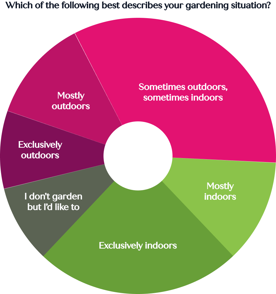
Gardening indoors is an underserved hobby, despite being more common than gardening outdoors
The majority (70%) of survey participants garden indoors at least as much as they garden outdoors, with 24% gardening exclusively indoors
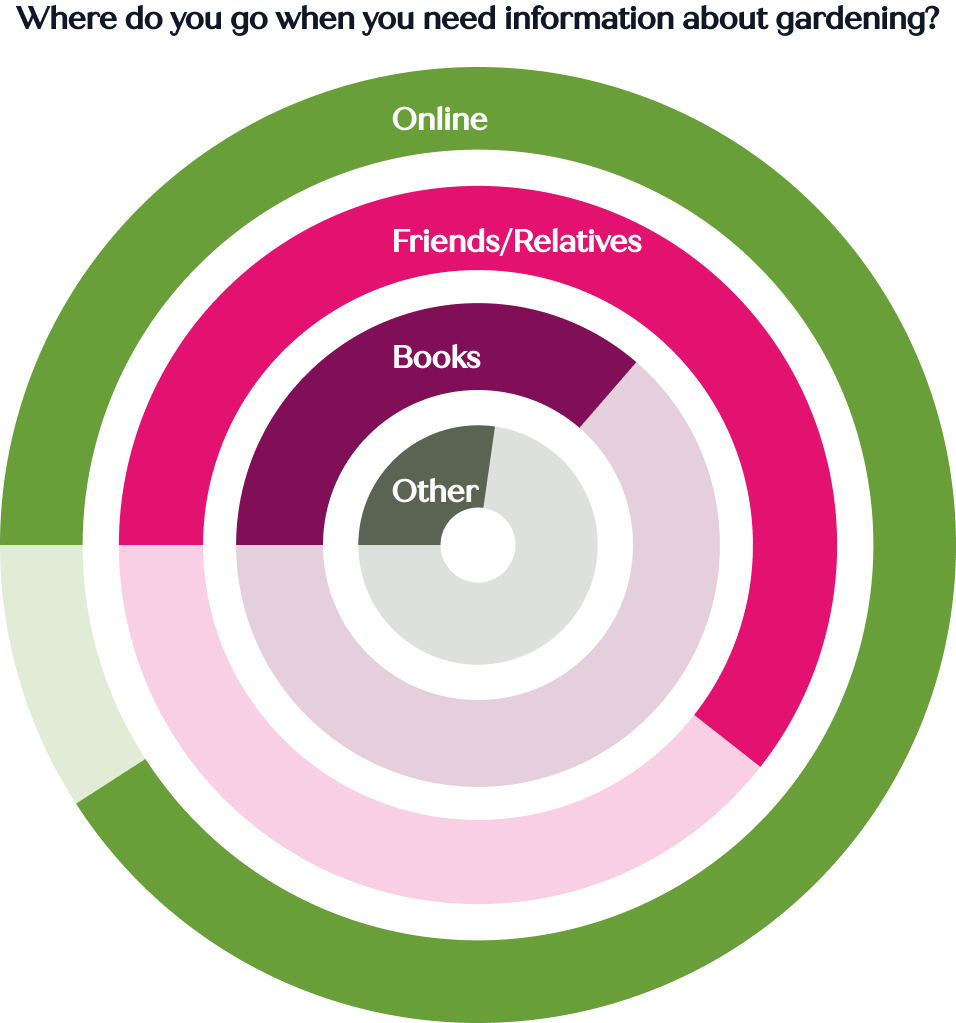
Finding information requires an extant community or the ability to comb through search results
The majority (67%) of survey participants look at online blogs to find gardening information they need
In addition, 60% of survey participants and 100% of interview participants turn to specific friends and family members when they need gardening information
Gardening habits vary widely, including seasonally
Gardening knowledge needs to be personalized to:
Geographic location
Type of gardening
Resource access
Every interview participant said they want to be part of a gardening community, but didn’t know where to find one
Define
Pain Points
User Personas
Ideate
In addition to standard social media actions, I addressed user pain points by building in specific key features.
Key Features:
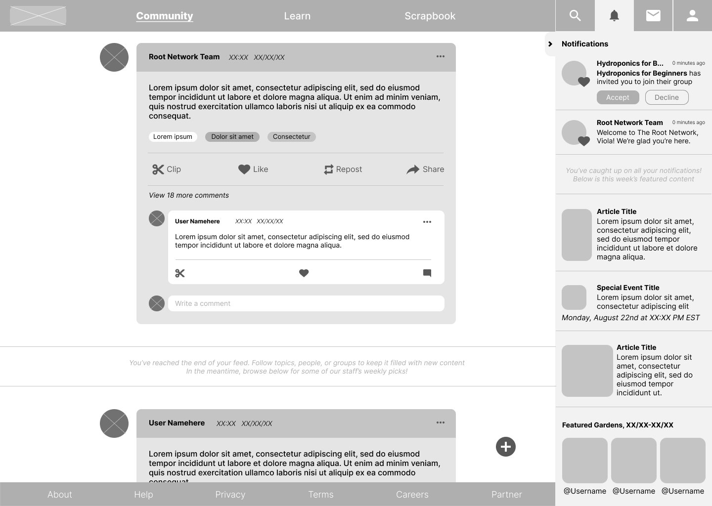
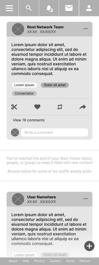
A main feature of the site, users can “clip” posts, pictures, and comments to save in their virtual scrapbook. They can have as many scrapbook pages as they want, and organize clippings however they see fit.
Users are able to earn various badges through community interaction with their posts and comments. These badges will aid others in judging the reliability of their advice.
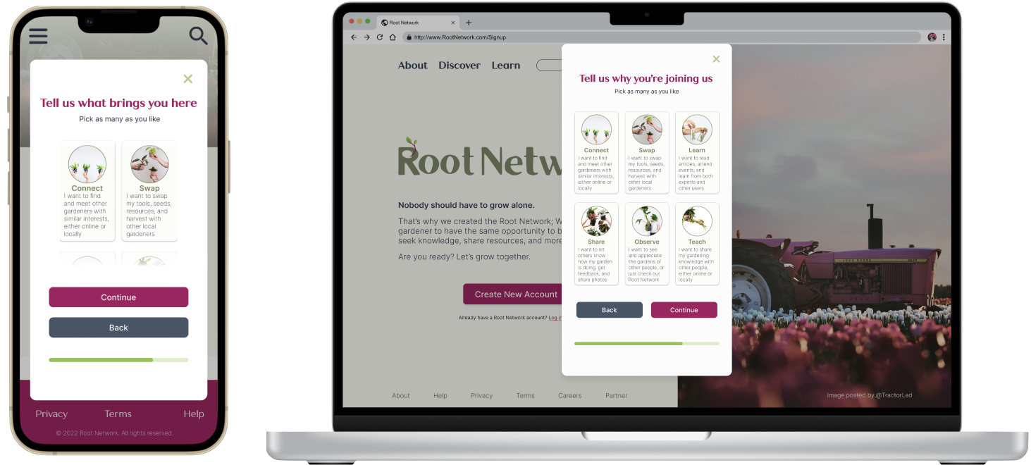
In addition to users being able to “follow” other accounts, they can join specialized groups to meet their specific needs. These groups are automatically suggested to the user based on choices made during the account creation flow, and can also be found via search or tags. They’re based on location, experience level, type of gardening, specialized interests, and more.
A curated tag system gives users an easy way to search and explore information and groups relevant to their interests.
Wireframing
I compared features of other social media sites in their mobile and desktop layouts as basis for constructing wireframes for Root Network.
View both the mobile and desktop low-fidelity prototypes here.
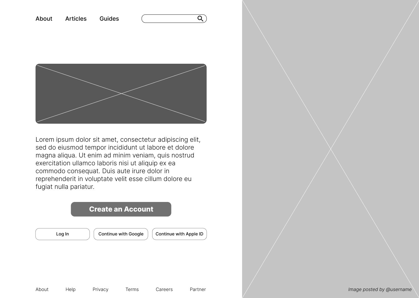
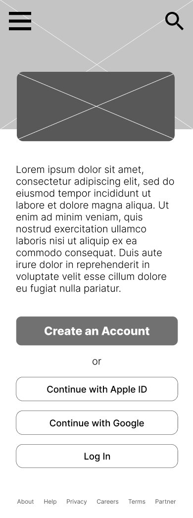
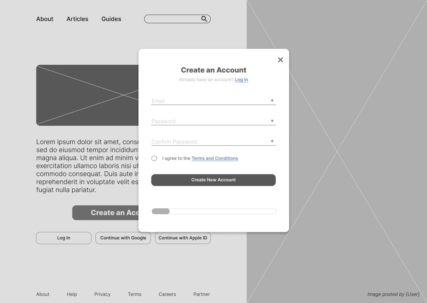
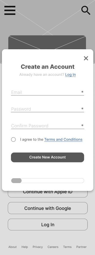


Prototype
Branding
Root Network was a fictional product and so did not have any extant design guidelines.

I directly lifted the colors used in Root Network’s branding from a photo of my tradescantia (a common houseplant). The two shades of green are commonly seen in gardening, while the magenta adds contrast and color, evoking blooms and variegated leaves.
I picked a playful serif font to use for headings, and chose a versatile sans serif font family for all other text.
While most of the icons were from the Material Design system, the iconography for a central feature of the website required extra thought.
The scrapbook feature allows users to save posts in collections, akin to a physical scrapbook or a digital board (a la Pinterest.) Because much of the target user base would have more familiarity with the physical concept of clipping out an article to save for later, a pair of scissors was chosen to represent “clipping” a post for the scrapbook.

Usability Studies
I conducted a formal moderated usability study for this project. After reviewing the study recordings and notes, I created an affinity diagram to synthesize insights.
Findings
3 out of 5 participants noted that the desktop account confirmation screen was missing a way to edit information that was entered incorrectly
The instruction text below each heading wasn’t noticeable enough for 3 out of 5 participants
Every participant (5 of 5) stated that the process felt exactly the same between desktop and mobile
Affinity Diagram
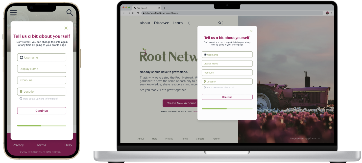
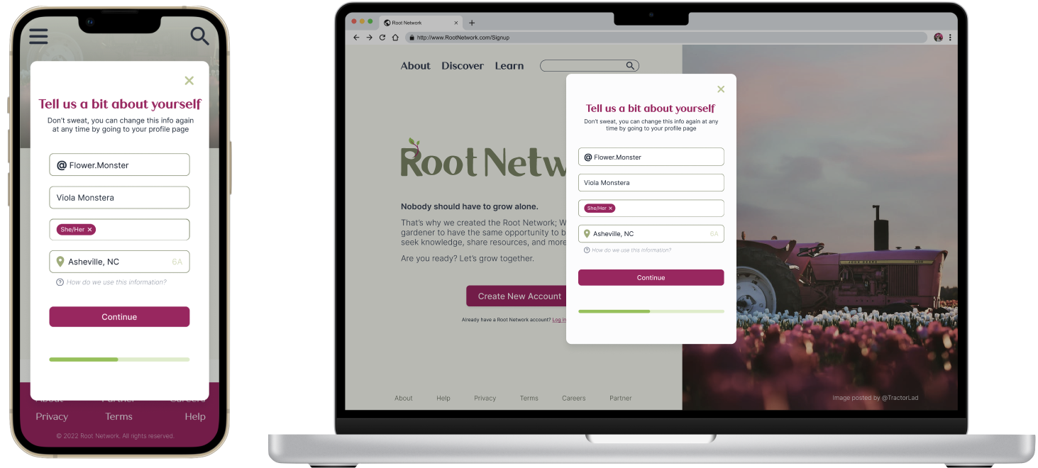
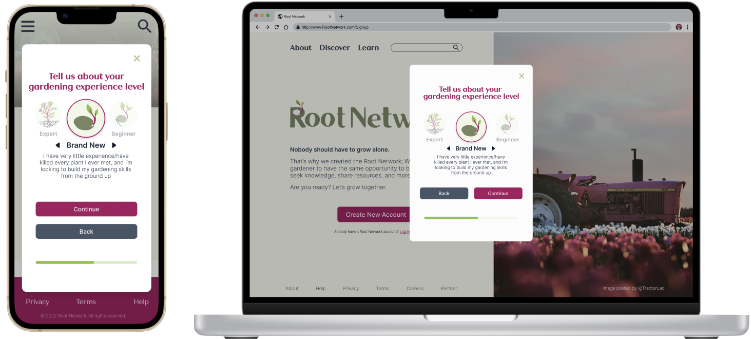
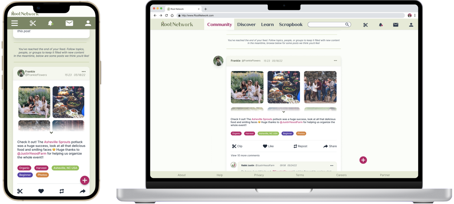
High Fidelity Prototype
This high-fidelity prototype synthesized insights from the previous usability study in order to improve upon the initial wireframes and give the users a better account creation experience.
Takeaways
For this project, I really focused on modularity, creating alternate versions of each component for desktop vs mobile. I learned a lot about how important predetermined design systems can be when designing for multiple experiences at once.
Because of this, I became intimately familiar with Figma’s component system, and ended up with a robust library of multi-property variants. Creating these designs for both desktop and mobile was a new challenge for me, but it was rewarding.
I’m pleased with how I incorporated the site’s design into the user’s first interaction with the Root Network, and overall feel like I learned a lot about how the key features of the site affected the account creation flow.
This project was done for the Google UX Design Professional Certificate, completed through Coursera in spring 2022.
This training covered:
Information architecture development
Sitemap construction
Responsive web design
Basic familiarity with Adobe XD
