A Note About Just Sushi’s Accessibility:
At this point in my design education, I was unfamiliar with WCAG, and so there are portions of my design that do not have enough contrast. Luckily, I have since filled that knowledge gap.
I think it’s important to learn from my mistakes rather than erase them. So instead of going back through this project and adjusting the colors to meet contrast guidelines, they are preserved here as a testament to my ongoing education.
Introduction
Just Sushi is a fictional sushi restaurant in NYC with a focus on sustainability, safety, and customer experience. The point was to create a delivery app from the ground up. Since the company is fictional, I also ended up developing branding for them.
The Problem
Conscientious sushi lovers are unable to order sushi delivery in a way that aligns with their values, is tailored to the problems sushi delivery presents, and doesn’t rely on 3rd party gig workers.
The Goal
We want to give the ethically-minded sushi lover an easy, curated, and safe way to order sushi delivery.
Research
Competitive Audit
In order to understand the informational and ordering experiences of competitors, I did a competitive audit of 3 different businesses: Sugarfish, an upscale national chain and direct competitor, Momo Sushi, a humble local sushi restaurant and direct competitor, and Caviar, a 3rd party delivery service and indirect competitor.
Findings
-Only Caviar had integrated delivery tracking
-None had ways to filter for allergens
-None mentioned how temperature is controlled for in the delivery process
Opportunities
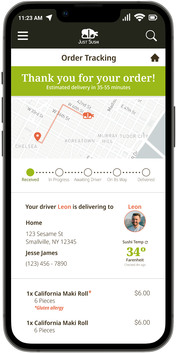
-Provide detailed order tracking
-Provide a way to filter for allergies
-Provide information about temperature control during delivery
User Personas
Pain Points
User Interviews
In order to identify user problems and needs when it comes to sushi delivery, I conducted a series of 6 user interviews focused on food delivery in general and sushi delivery in particular.
The interview participants consisted of 1 man, 2 women, and 3 nonbinary individuals, ranging in age between 21-35, and who order sushi at least once a month.
Going in, I assumed the biggest concern for users would be temperature management. While this was a concern for all users (all 6 noted temperature as a factor), the need for specificity in item descriptions, menu categories, and customer service interactions (4 of 6 users), the lack of curation and reviews for individual items (3 of 6 users), and the detrimental effects of 3rd party services on both drivers and restaurants (5 of 6 users) all emerged as clear user problems.
This data crystallized into four pain points: specificity, curation, safety, and equity.
Ideate
Wireframing
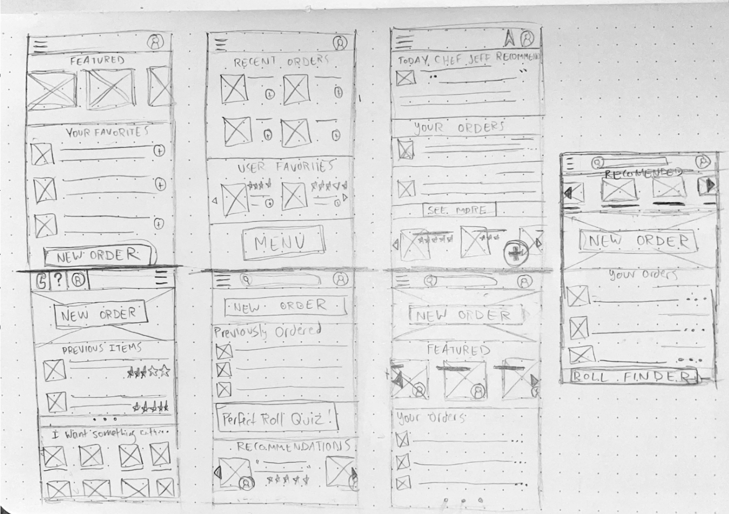
Beginning with pencil and paper wireframes allowed me to iterate on my ideas quickly and without being slowed by tech– if I wanted to change something, all it took was an eraser.
Design
Branding
Given the fact that Just Sushi is a fictional restaurant and therefore did not have any extant branding, I designed a logo, compiled a color scheme and chose a two font families to serve for the app design.
I chose the colors based on color psychology. Green for environmentally conscious, orange for friendliness, and red for connection to food. The shades I chose corresponded to common colors in sushi– avocado, carrot, and salmon.
I picked a serif font to use for H1 and buttons, and a similar sans-serif for H2, H3, and body text.
Finally, for iconography, I took mostly modified selections from the Material Design system.
Usability Studies
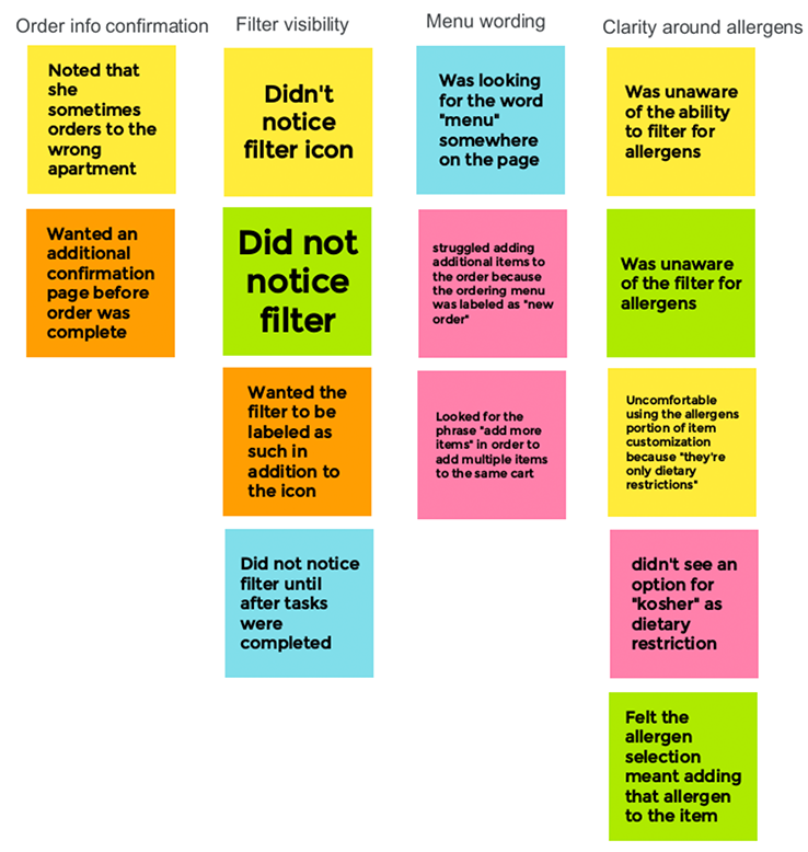
I conducted two rounds of formal moderated usability studies for this project. After reviewing the study recordings and notes, I created an affinity diagram to synthesize insights.
Round 1 Findings
Users found the menu filter was easy to overlook
The wording around the Menu button was unclear
Users found wording around dietary restrictions was unclear
Users wanted more opportunities to review their order info
Round 2 Findings
Delivery information needed selection indicators
Users wanted an option to re-order past dishes
Users felt there were too many screens involved in checkout
Affinity Diagram
High Fidelity Prototype
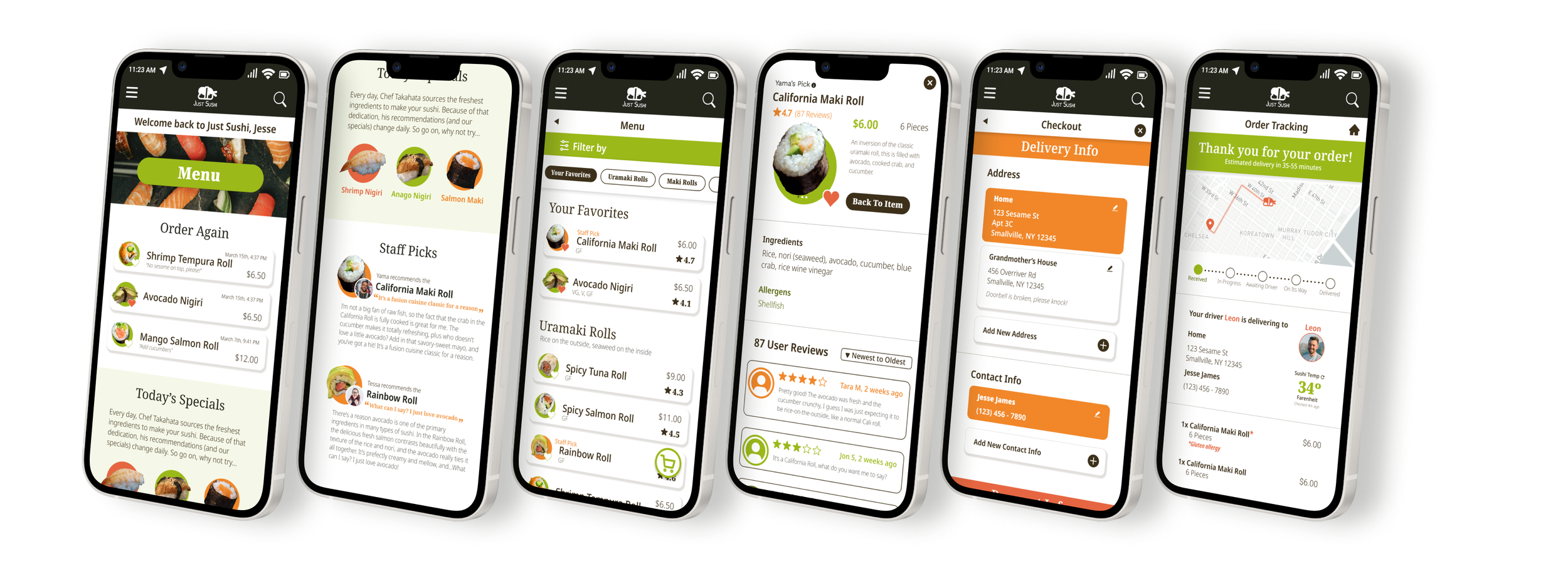
This high-fidelity prototype synthesized insights from the previous usability studies in order to improve upon our initial wireframes and give the users a better overall experience.
Takeaways
From crafting user personas, to building wireframes, to conducting usability studies, to creating interactive prototypes in Figma, to say I learned a lot over the course of this project would be a massive understatement. I came into this with little experience in UX Design, and I leave it confident in my ability to help build a user-centered product from the ground up.
What most stuck with me was this, though:
Walking into this course, I had some inkling that UX design would be up my alley. I didn’t know UX Design would be the perfect blending of my interests and talents.
I started my journey in psychology, moved to botany and ecology, then graphic design, professional storytelling, and community management.
Everything I’ve done has been building to UX, every scrap of my experience is applicable to at least some part of the design process, and I couldn’t be more thrilled to continue my journey.
This project was done for the Google UX Design Professional Certificate, completed through Coursera in winter 2022.
This training covered:
The Design Thinking Process
Conducting user research and competitive analyses
Design sprints, storyboarding, and Crazy 8s
Wireframing and prototyping on paper and in Figma
Planning, conducting, and analyzing usability studies
Critiques and research presentation


